Feature Interaction Charting#
![]()

This tool is made for quick interactions visualization between variables in a dataset. User can specify the variables to be plotted on the x, y and hue (color) parameters. The tool automatically picks chart type to render based on the detected variable types and renders 1/2/3-way interactions.
This feature can be useful in exploring patterns, trends, and outliers and potentially identify good predictors for the task.
Using Interaction Charts for Missing Values Filling#
Let’s load the titanic dataset:
import pandas as pd

df_train = pd.read_csv('https://autogluon.s3.amazonaws.com/datasets/titanic/train.csv')
df_test = pd.read_csv('https://autogluon.s3.amazonaws.com/datasets/titanic/test.csv')
target_col = 'Survived'
Next we will look at missing data in the variables:
import autogluon.eda.auto as auto

auto.missing_values_analysis(train_data=df_train)
Missing Values Analysis
| missing_count | missing_ratio | |
|---|---|---|
| Age | 177 | 0.198653 |
| Cabin | 687 | 0.771044 |
| Embarked | 2 | 0.002245 |
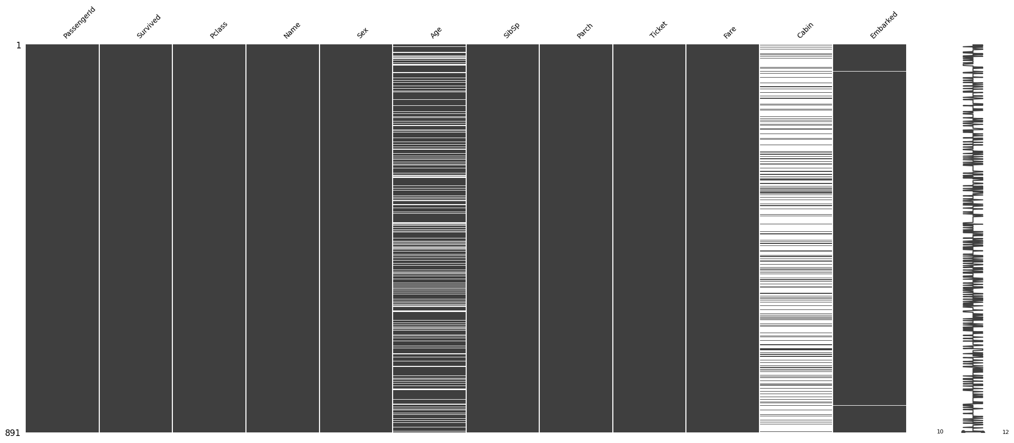
It looks like there are only two null values in the Embarked feature. Let’s see what those two null values are:
df_train[df_train.Embarked.isna()]
| PassengerId | Survived | Pclass | Name | Sex | Age | SibSp | Parch | Ticket | Fare | Cabin | Embarked | |
|---|---|---|---|---|---|---|---|---|---|---|---|---|
| 61 | 62 | 1 | 1 | Icard, Miss. Amelie | female | 38.0 | 0 | 0 | 113572 | 80.0 | B28 | NaN |
| 829 | 830 | 1 | 1 | Stone, Mrs. George Nelson (Martha Evelyn) | female | 62.0 | 0 | 0 | 113572 | 80.0 | B28 | NaN |
We may be able to fill these by looking at other independent variables. Both passengers paid a Fare of $80, are
of Pclass 1 and female Sex. Let’s see how the Fare is distributed among all Pclass and Embarked feature
values:
auto.analyze_interaction(train_data=df_train, x='Embarked', y='Fare', hue='Pclass')
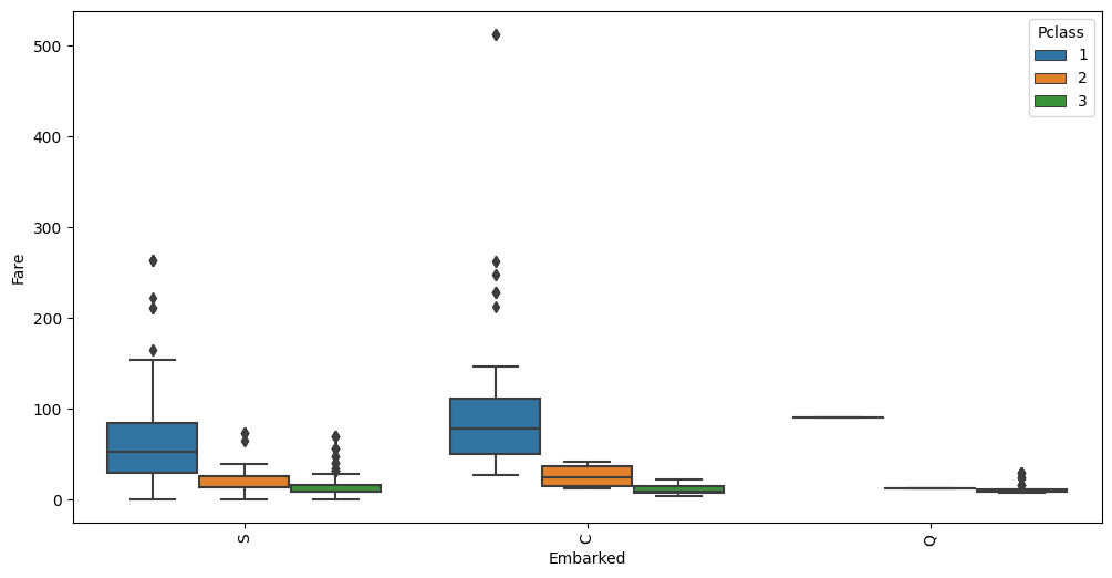
The average Fare closest to $80 are in the C Embarked values where Pclass is 1. Let’s fill in the missing
values as C.
Using Interaction Charts To Learn Information About the Data#
auto.analyze_interaction(x='Pclass', y='Survived', train_data=df_train, test_data=df_test)
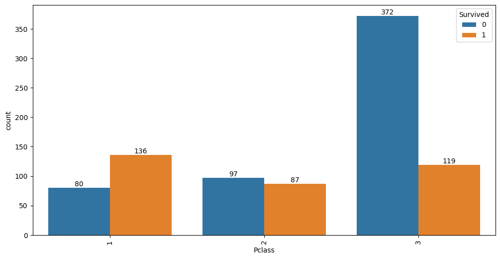
It looks like 63% of first class passengers survived, while; 48% of second class and only 24% of third class
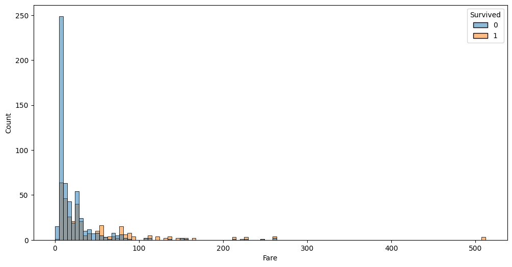
passengers survived. Similar information is visible via Fare variable:
auto.analyze_interaction(x='Fare', hue='Survived', train_data=df_train, test_data=df_test, chart_args=dict(fill=True))
auto.analyze_interaction(x='Age', hue='Survived', train_data=df_train, test_data=df_test)
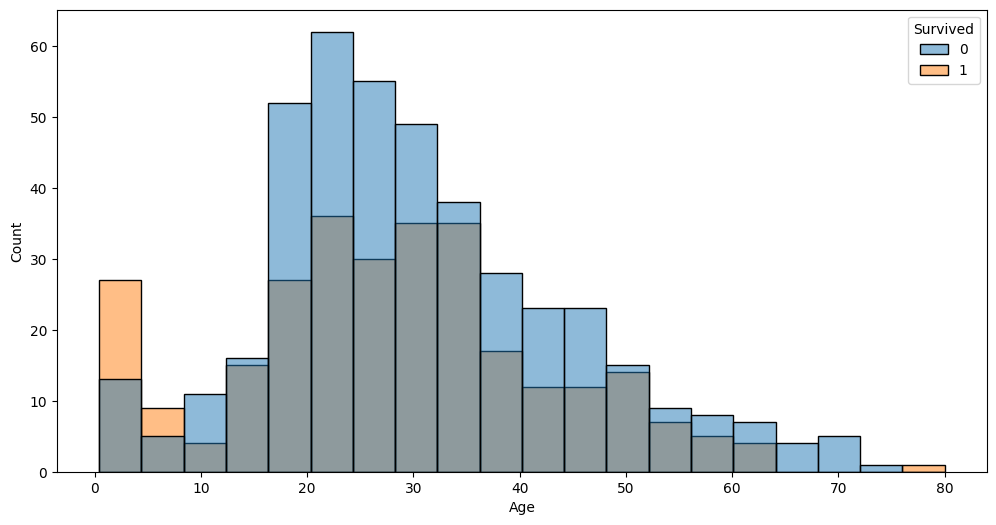
The very left part of the distribution on this chart possibly hints that children and infants were the priority.
auto.analyze_interaction(x='Fare', y='Age', hue='Survived', train_data=df_train, test_data=df_test)
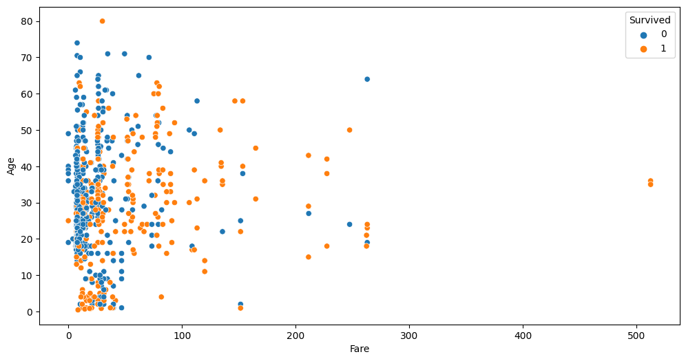
This chart highlights three outliers with a Fare of over $500. Let’s take a look at these:
df_train[df_train.Fare > 400]
| PassengerId | Survived | Pclass | Name | Sex | Age | SibSp | Parch | Ticket | Fare | Cabin | Embarked | |
|---|---|---|---|---|---|---|---|---|---|---|---|---|
| 258 | 259 | 1 | 1 | Ward, Miss. Anna | female | 35.0 | 0 | 0 | PC 17755 | 512.3292 | NaN | C |
| 679 | 680 | 1 | 1 | Cardeza, Mr. Thomas Drake Martinez | male | 36.0 | 0 | 1 | PC 17755 | 512.3292 | B51 B53 B55 | C |
| 737 | 738 | 1 | 1 | Lesurer, Mr. Gustave J | male | 35.0 | 0 | 0 | PC 17755 | 512.3292 | B101 | C |
As you can see all 4 passengers share the same ticket. Per-person fare would be 1/4 of this value. Looks like we can add a new feature to the dataset fare per person; also this allows us to see if some passengers travelled in larger groups. Let’s create two new features and take at the Fare-Age relationship once again.
ticket_to_count = df_train.groupby(by='Ticket')['Embarked'].count().to_dict()
data = df_train.copy()
data['GroupSize'] = data.Ticket.map(ticket_to_count)
data['FarePerPerson'] = data.Fare / data.GroupSize

auto.analyze_interaction(x='FarePerPerson', y='Age', hue='Survived', train_data=data)
auto.analyze_interaction(x='FarePerPerson', y='Age', hue='Pclass', train_data=data)
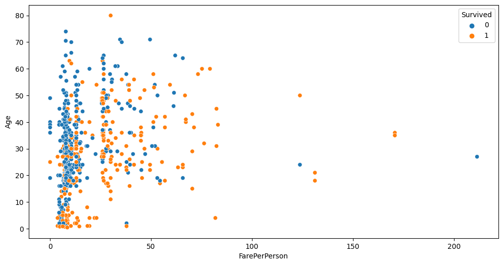
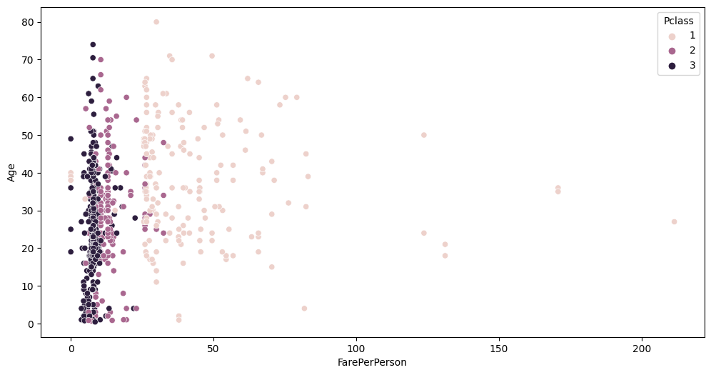
You can see cleaner separation between Fare, Pclass and Survived now.