
Feature Interaction Charting
This tool is made for quick interactions visualization between variables in a dataset. User can specify the variables to be plotted on the x, y and hue (color) parameters. The tool automatically picks chart type to render based on the detected variable types and renders 1/2/3-way interactions.
This feature can be useful in exploring patterns, trends, and outliers and potentially identify good predictors for the task.
Using Interaction Charts for Missing Values Filling
Let’s load the titanic dataset:
import pandas as pd

df_train = pd.read_csv('https://autogluon.s3.amazonaws.com/datasets/titanic/train.csv')
df_test = pd.read_csv('https://autogluon.s3.amazonaws.com/datasets/titanic/test.csv')
target_col = 'Survived'
Next we will look at missing data in the variables:
import autogluon.eda.auto as auto

auto.missing_values_analysis(train_data=df_train)
Missing Values Analysis
| missing_count | missing_ratio | |
|---|---|---|
| Age | 177 | 0.198653 |
| Cabin | 687 | 0.771044 |
| Embarked | 2 | 0.002245 |
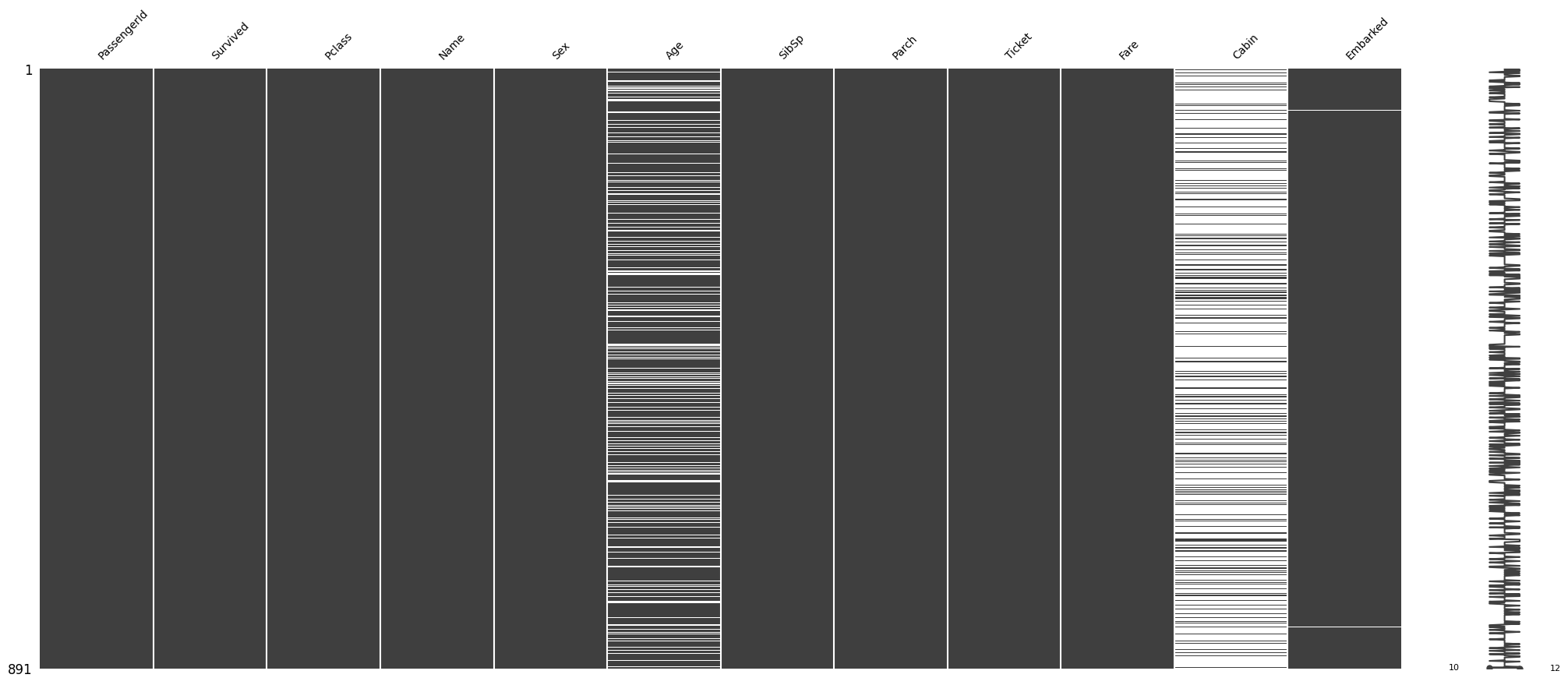
It looks like there are only two null values in the Embarked
feature. Let’s see what those two null values are:
df_train[df_train.Embarked.isna()]
| PassengerId | Survived | Pclass | Name | Sex | Age | SibSp | Parch | Ticket | Fare | Cabin | Embarked | |
|---|---|---|---|---|---|---|---|---|---|---|---|---|
| 61 | 62 | 1 | 1 | Icard, Miss. Amelie | female | 38.0 | 0 | 0 | 113572 | 80.0 | B28 | NaN |
| 829 | 830 | 1 | 1 | Stone, Mrs. George Nelson (Martha Evelyn) | female | 62.0 | 0 | 0 | 113572 | 80.0 | B28 | NaN |
We may be able to fill these by looking at other independent variables.
Both passengers paid a Fare of $80, are of Pclass 1 and
female Sex. Let’s see how the Fare is distributed among all
Pclass and Embarked feature values:
auto.analyze_interaction(train_data=df_train, x='Embarked', y='Fare', hue='Pclass')
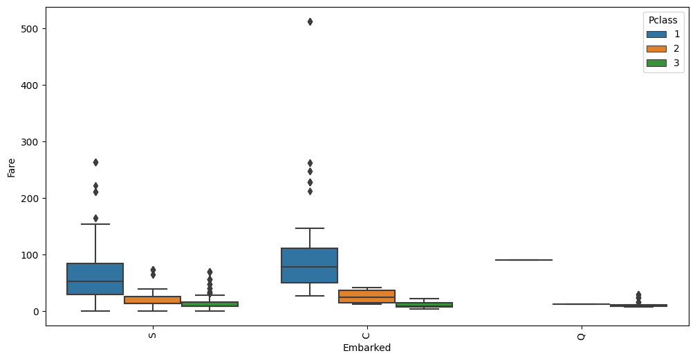
The average Fare closest to $80 are in the C Embarked
values where Pclass is 1. Let’s fill in the missing values as
C.
Using Interaction Charts To Learn Information About the Data
auto.analyze_interaction(x='Pclass', y='Survived', train_data=df_train, test_data=df_test)
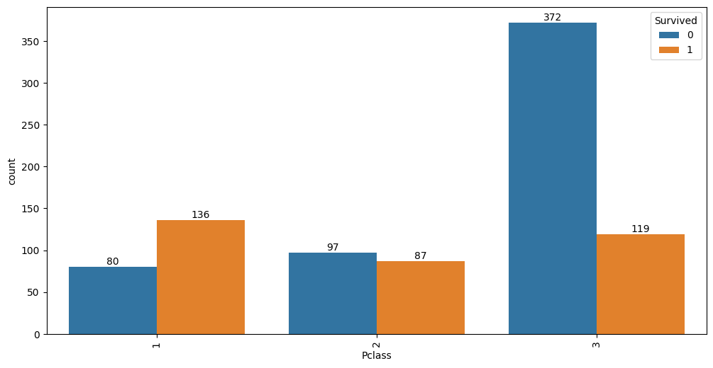
It looks like 63% of first class passengers survived, while; 48%
of second class and only 24% of third class passengers survived.
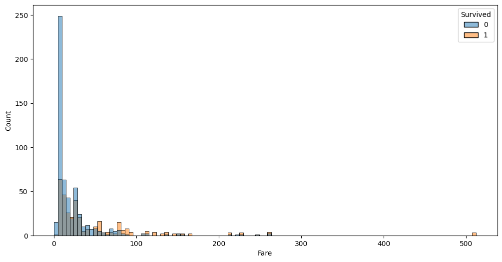
Similar information is visible via Fare variable:
auto.analyze_interaction(x='Fare', hue='Survived', train_data=df_train, test_data=df_test, chart_args=dict(fill=True))
auto.analyze_interaction(x='Age', hue='Survived', train_data=df_train, test_data=df_test)
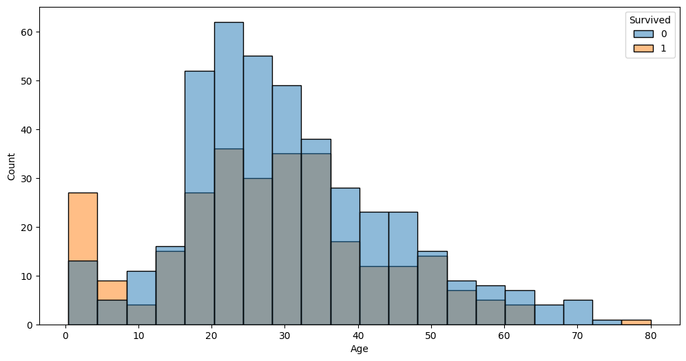
The very left part of the distribution on this chart possibly hints that children and infants were the priority.
auto.analyze_interaction(x='Fare', y='Age', hue='Survived', train_data=df_train, test_data=df_test)
This chart highlights three outliers with a Fare of over $500. Let’s
take a look at these:
df_train[df_train.Fare > 400]
| PassengerId | Survived | Pclass | Name | Sex | Age | SibSp | Parch | Ticket | Fare | Cabin | Embarked | |
|---|---|---|---|---|---|---|---|---|---|---|---|---|
| 258 | 259 | 1 | 1 | Ward, Miss. Anna | female | 35.0 | 0 | 0 | PC 17755 | 512.3292 | NaN | C |
| 679 | 680 | 1 | 1 | Cardeza, Mr. Thomas Drake Martinez | male | 36.0 | 0 | 1 | PC 17755 | 512.3292 | B51 B53 B55 | C |
| 737 | 738 | 1 | 1 | Lesurer, Mr. Gustave J | male | 35.0 | 0 | 0 | PC 17755 | 512.3292 | B101 | C |
As you can see all 4 passengers share the same ticket. Per-person fare would be 1/4 of this value. Looks like we can add a new feature to the dataset fare per person; also this allows us to see if some passengers travelled in larger groups. Let’s create two new features and take at the Fare-Age relationship once again.
ticket_to_count = df_train.groupby(by='Ticket')['Embarked'].count().to_dict()
data = df_train.copy()
data['GroupSize'] = data.Ticket.map(ticket_to_count)
data['FarePerPerson'] = data.Fare / data.GroupSize

auto.analyze_interaction(x='FarePerPerson', y='Age', hue='Survived', train_data=data)
auto.analyze_interaction(x='FarePerPerson', y='Age', hue='Pclass', train_data=data)
You can see cleaner separation between Fare, Pclass and
Survived now.